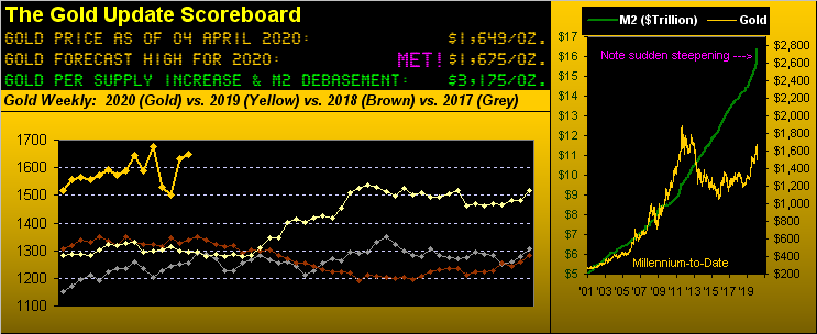
Gold Scoreboard
We’re of the long-running belief that everything — and then some — is all but instantaneously priced into major markets, or at least sufficiently so swiftly that ’tis nearly impossible for the human trader to take advantage, save for those having steely guts and deep enough pockets to weather the whipsaws within.
Rather, replete ’round it all comes “I shudda bought” or “I shudda sold” because “I knew it was coming.” Yeah, so did my aunt. And per usual, every stripe of media focuses on the illusion of markets’ changes instead of on the truth of markets’ prices.
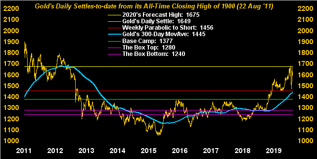
So let’s talk a little truth with respect to this week’s title. Indeed across many recent weeks, we’ve explained time and again as to why Gold hasn’t gotten into the overdrive gear it needs to propel price up to where so many — from institutional investors to non-financial folks — think it ought now be — i.e. 2000+ or more broadly 3000+ — given all the “Queue-Eeee” and money thought to be free. One can go back and read what we’ve written previously, but as weekly we pick up new readers, to put it briefly: Gold 1700+ is fraught with massive overhead structurally-resistive pricing congestion stemming back to the years 2011-2013. ‘Course Gold can — and will — get up through it: but to date, be it the sovereigns, the banks, or the hedgies, none have stepped sufficiently forward –be it as one or en masse — to boldly hit the overhead offers above 1700.
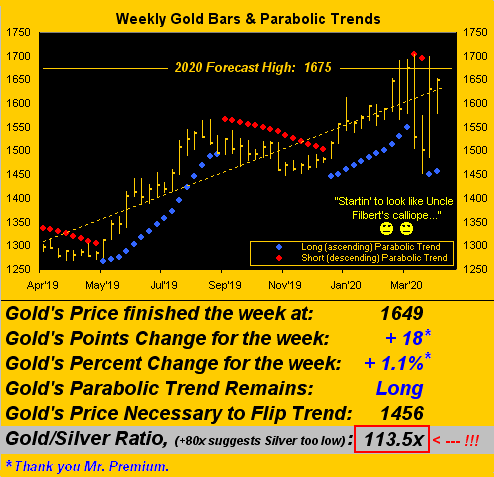
And thus here Gold sits having closed out the week Friday at 1649. To be sure that appears as an “up” week on the above Gold Scoreboard as well as in the below weekly bars. But here’s the BIG BUT: because (as we herein noted a week ago) Gold rolled from its April contract into that for June, there’s enough premium in the latter to give the impression (from charting as we do the so-called “perpetual contract”) that price increased for the week. Yet per the specific contracts: April Gold went from 1631 to 1634, i.e. +3 points; but now “front month” June Gold went from 1654 to 1649, i.e. -5 points. Diverge by the premium, converge by its passing.
Meanwhile StateSide, $2 trillion of faux dough gets created — with more being called to the table — and still we’ve “Gold Losing a Gear…” ‘Tis diabolical. Here are the weekly bars from one year ago-to-date:
Gold Weekly Bars & Parabolic Trends
As continues our title “…Markets Are Losing Their Fear”. What does that mean? The world is cowering in COVID fear, or at least from the economic fallout given the measures being dealt to combat COVID. Top-flight analysts are saying the stock market still has “oh so far still to fall.” Maybe they’ll be right, (gulp!). We don’t know. A favored market analyst of ours has been expounding on his radio show that this is merely the furthering of the 2008/2009 market crash, its rise since then primarily based on monetary proliferation and share buy-backs rather than real earnings.
As is our won’t, we simply go with the numbers. Here in 2020, the S&P 500 presently at 2489 (-23.0%) has traded as low as 2192 (-32.2% on 23 March); in other words ’tis momentarily +13.5% from that low. Yet our “live” price/earnings ratio is 30.5x: that’s very expensive by business school standards, but meaningless in a zero-percent interest rate world.
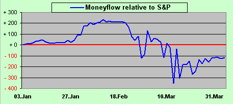
What we do know is the state of the S&P’s money flow, which as we showed a week ago reached its largest downside divergence from the S&P itself back on 12 March, well ahead of the noted 23 March low. Now here’s the updated view, suggesting that while the S&P “ought be” some 100 points lower than ’tis, such divergence has since narrowed from the -300 points money flow suggestion from back on 12 March, (i.e. big hands of late have been buying):
Moneyflow Relative To S&P
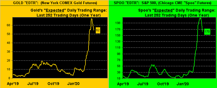
Moreover, another indication of fear draining away — and there’s still plenty of it — is the reduction in volatility. This may be the only place you’re gonna see this, so pay attention. The following two-panel chart shows us as measured from one-year ago-to-date for Gold on the left and the S&P 500 on the right our measure of expected daily trading range (“EDTR”) in points between high and low. And for both markets, (indeed across the entire spectrum of the BEGOS Markets for which you can see this measure at the website), the ranges whilst still vast are nonetheless narrowing. Clearly your neighborhood pajama-clad, the basement-dwelling day trader is sensitive to this, his new-fangled model foolishly devised under extremely volatile conditions now failing to work. Narrowing indeed: despite the “boxed” numbers shown below on your screen, for Friday, Gold’s “actual” trading range was just 28 points (66 was Friday’s EDTR) and that for the Spoo (S&P) was 81 points (180 was Friday’s EDTR). Fear is lessening, at least for now; ‘course uncertainty remains monstrous, but isn’t it always?
Gold SPOO Ranges
Again, given all the sudden monetary and fiscal accommodation goin’ on out there, ’tis common sense to expect Gold be far higher than presently ’tis; indeed the Gold Scoreboard’s calculation is for 3175 right now! But let’s put in some perspective. Since the 08 November 2016 StateSide elections there have been 855 trading days. The average daily closing price of the S&P 500 since then is 2708: today’s 2489 level is -8% lower; the average daily closing price of Gold since then is 1325: today’s 1649 level is +24% higher; and given the trend is Gold’s friend, “Don’t worry … Be happy”–(McFerrin, ’88). Gold’s 300-day moving average in the following graphic certainly is. Note the 1675 line as our forecast high for this year — given by that which is going on we ought be terribly wrong — and yet the leftmost area of the graphic starkly shows the aforementioned overhead structural congestion:
Gold Daily Settles
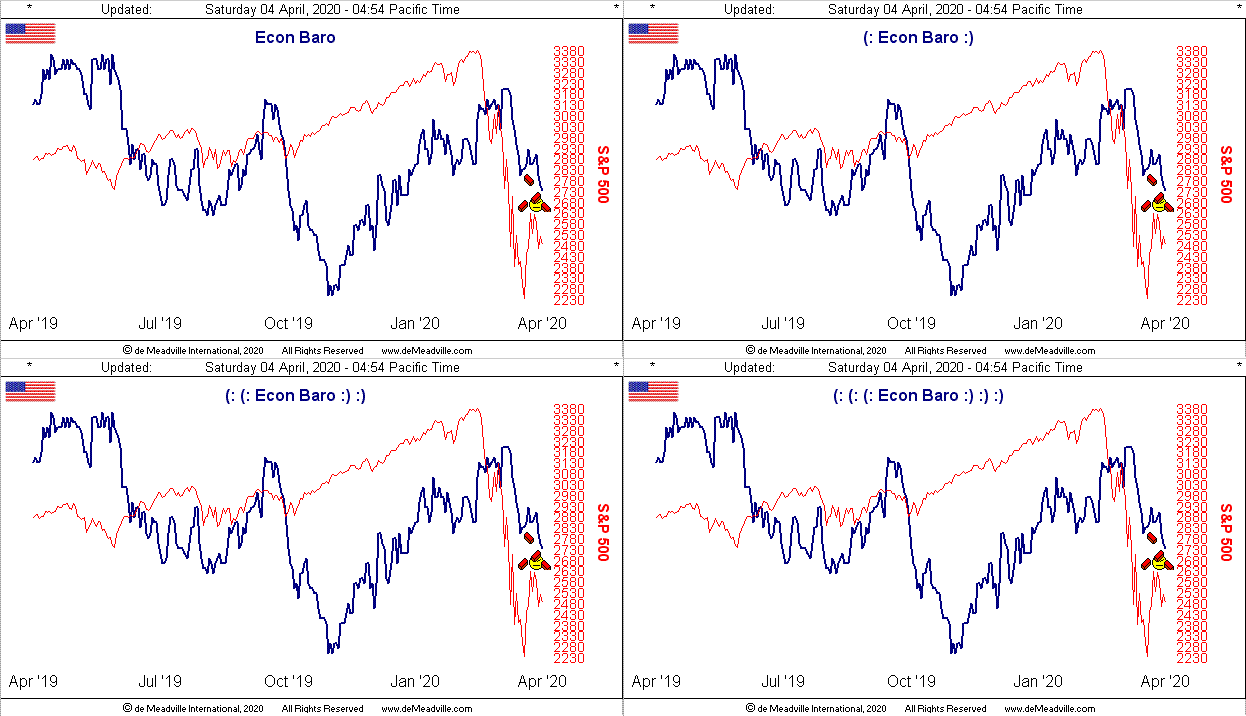
As for the Economic Barometer, we shan’t re-hash all the numbers being universally broadcast: they’re turning lousy and shall get much worse. Here’s the good news: our sense remains that this whole cessation of the economic engine shall be short-lived, that flipping the switch back on — combined with common sense return-to-work measures — shall occur sooner than later. The vast majority of the workforce is hardly in a high-risk COVID category: take prudent measures around those who are elderly, don’t forget to take your One-a-Day Vitamin “Now with hydroxychloroquine!” and let’s get on with life’s program. Indeed the declining volatility and recovering money flow may already be beginning to price that in. “I shudda bought!” (Beware catching the falling knife, Auntie). Either way, Here’s the Baro:
Economic Barometer
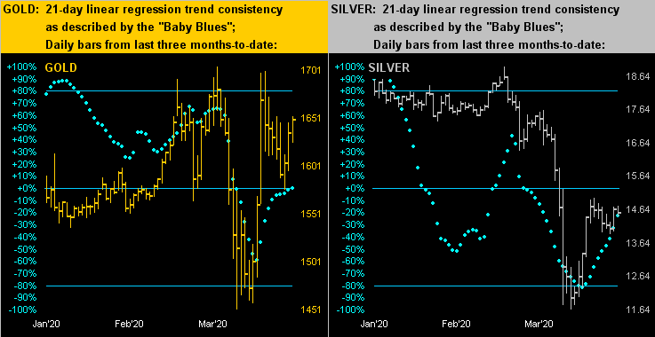
Now to our two-panel graphic of the precious metals’ daily bars from three months ago-to-date along with their baby blue dots of linear regression trend consistency. For Gold at left, the “Baby Blues” are rather meekly attempting to cross above their 0% axis, whereas those for Silver at right are still playing catch-up, the Gold/Silver ratio as noted earlier a staggeringly high 113.5x, nearly double the millennium-to-date average of 65.4x, at which ratio Silver today rather than at 14.53 would be +73.4% higher at 25.19. Then extrapolate that into yer Silver mining companies’ stock price leverage (!):
Gold Silver Dots
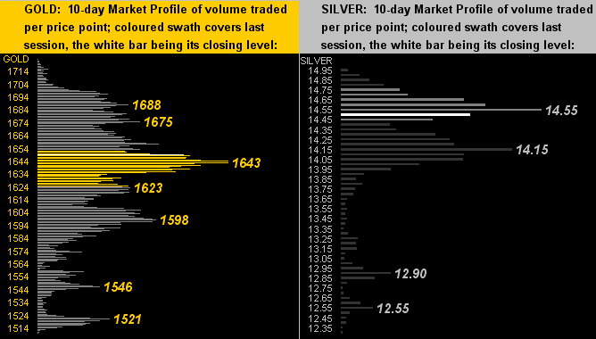
As for their 10-day Market Profiles, we find Gold (below left) at 1649 sitting just above its most commonly traded price across the past fortnight (in June pricing terms) of 1643, whilst Sister Silver (below right) at 14.53 is just 2c under her most commonly traded price of 14.55:
Gold Silver Profiles
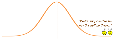
In summary, Gold essentially had a nowhere week as if role-playing “Nowhere Man”–(BeaTles, ’65). ‘Twas Gold’s narrowest trading week — in spite of everything for which Gold could ever wish in order to zoom much higher — since that ending 21 February. Talk about living way off on the flat end of the bell curve! Just make sure you’re not positioned flat in Gold once the buyers have nerve.
Bellcurve
