There is now a quite widely held conviction that following its major breakout and strong runup, silver will need to correct back further than it has thus far to ease its overbought condition, but the evidence that we are going to consider today suggests that it will do the opposite, and take off higher again.
On its latest 6-month chart we can see that following its mid-July breakout and strong runup silver eventually succumbed to the weakness in gold that set in early in the month and dropped back, but strong buying quickly kicked and arrested the decline. Price/volume action looks decidedly bullish with the pattern that has formed looking like a small bull Pennant, especially as it has been accompanied by strong upside volume that has driven the Accumulation line higher even as the price has languished within the confines of the Pennant. This Pennant has afforded some time for the earlier heavily overbought condition to ease. Also making an upside breakout from this small Pennant more likely is the volume dieback as it has formed and the existence of a similar Pennant pattern in gold and very bullish looking setups in many PM stocks that prompted a wave of write-ups of various good looking stocks on the site last week.
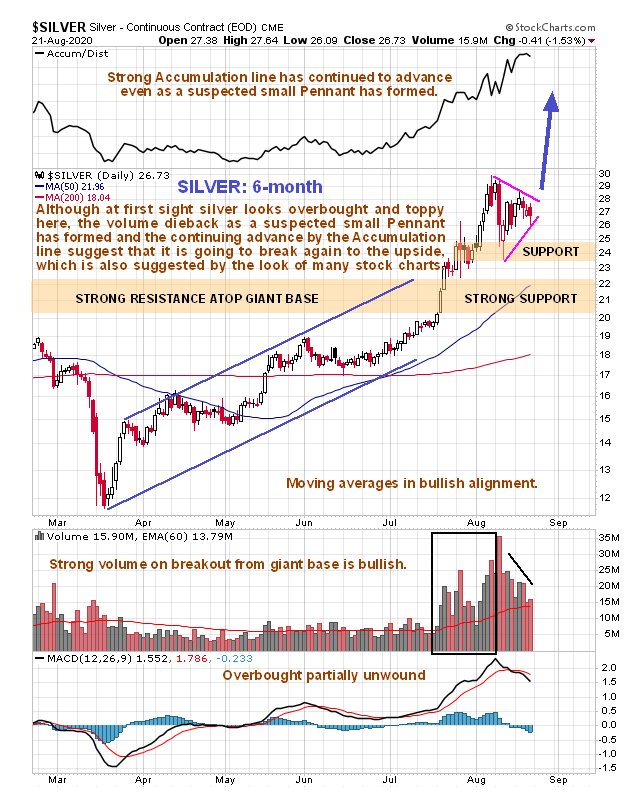
Silver Monthly Chart
The latest COT chart for silver if it is to be believed, shows a truly remarkable situation. Normally, after a big runup in silver, we would expect to see the Large Specs long positions ratchet up to an extreme level, but that hasn’t happened at all on this occasion – their positions are still at a modest level. What does this mean? – the only thing I can think of is that it means that they don’t believe in this rally and are not committing to it. Since they are almost always wrong, their lack of interest after this big runup must be interpreted as strongly bullish.
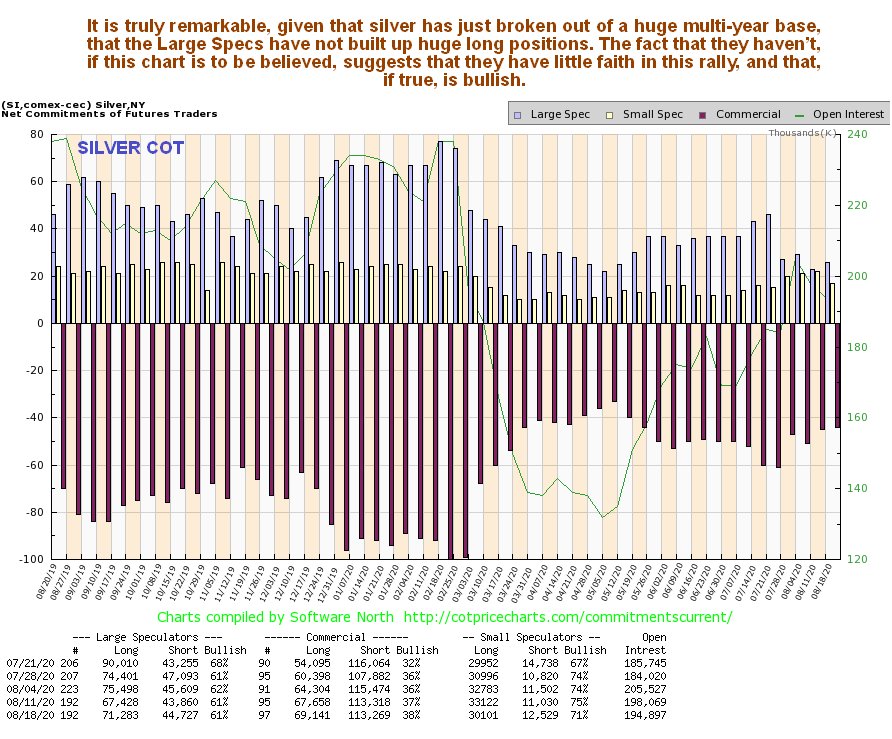
Silver COT Report
Silver does admittedly look quite heavily overbought on its 15-month chart, so it is understandable that many are wary here. Nevertheless, it looks like it going up anyway for the reasons just discussed. On this chart we can see why silver accelerated away to the upside once it cleared the $20 level, and that is because once it cleared the $20 level it had risen above all prior peaks during this timeframe, and of course getting above the psychologically important round number $20 level – you have to feel a little sorry for anyone who went short at $19.60.
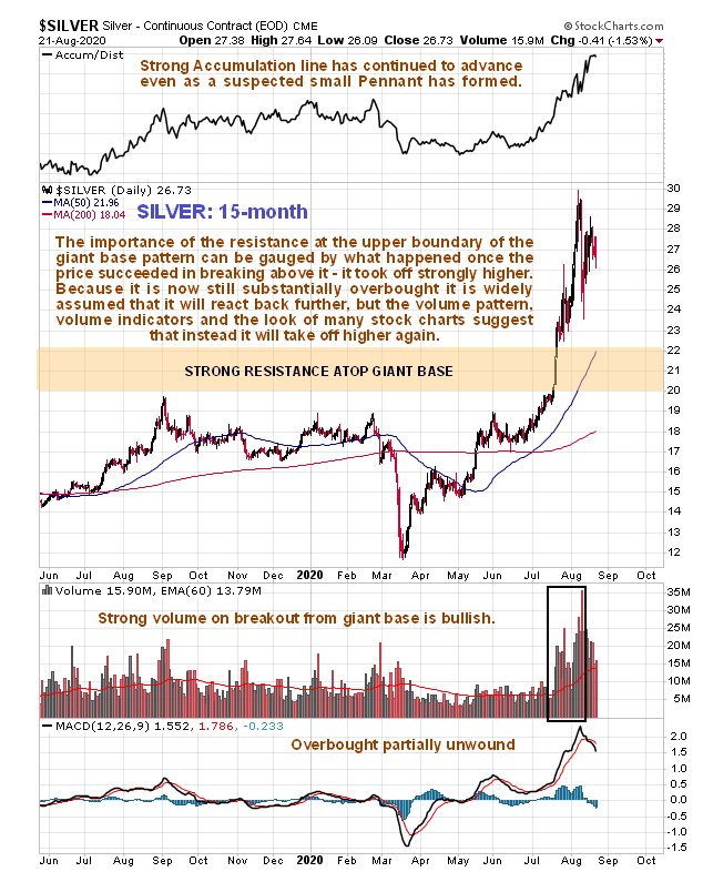
Silver 15 Month Daily Chart
On the long-term 13-year chart we can readily see the great significance of the July breakout, as this chart makes clear that this decisive breakout was from a giant Double Bottom base pattern that started to form in late 2014 and 2015. Curiously, there was a false abort of the pattern back in March, but come to think of it, there was a false abort in just about everything at that time, before the Fed valiantly rode to the rescue. Whilst we would ordinarily expect a longer period of consolidation or a reaction after such a vertical spike into significant resistance, these are truly extraordinary times which are seeing the Fed ramping up liquidity at a fantastic unprecedented rate, so silver could continue to spike higher at a rapid rate.
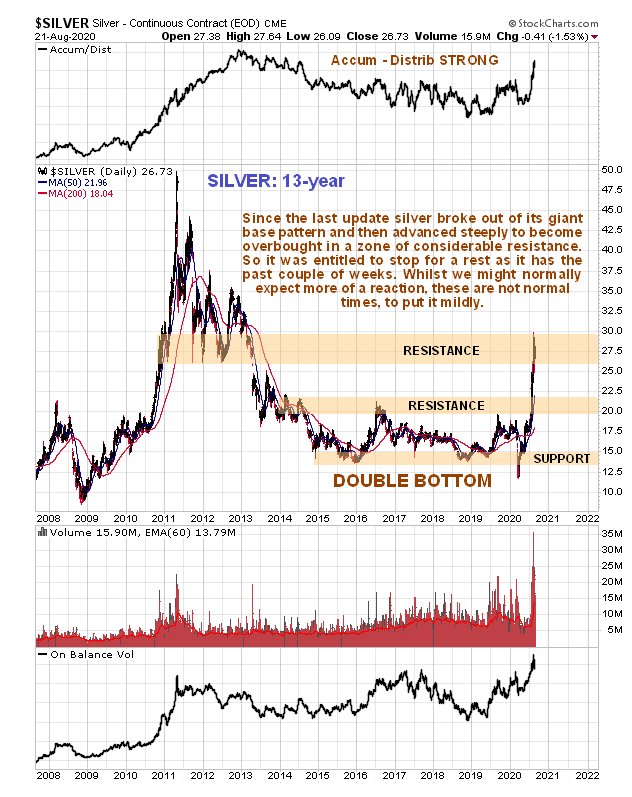
Silver 13 Year Chart
Silver latest optix or optimism chart shows that the bullishness towards it has plummeted over the past couple of weeks, and the more this reading drops the more bullish it is for silver, and it has now dropped sufficiently to permit another substantial rally.
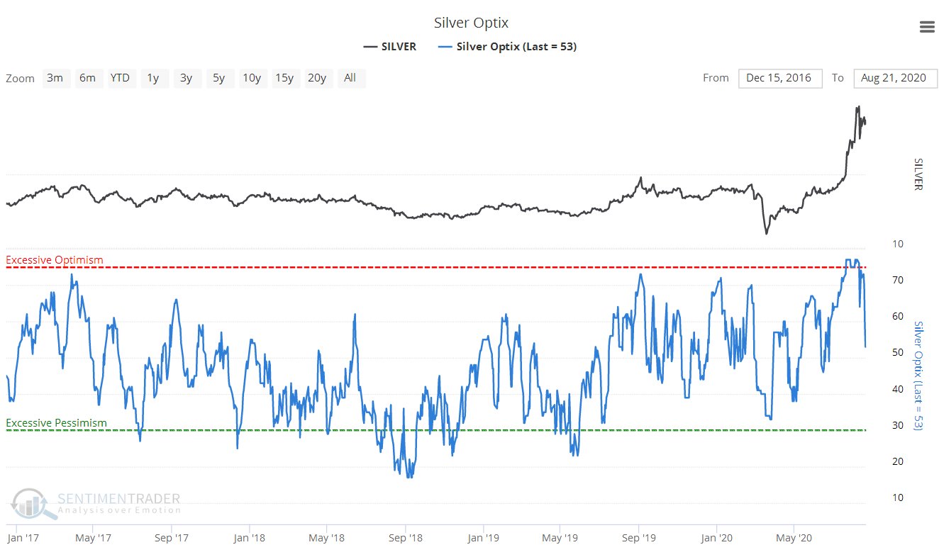
Silver Optix Chart
Finally, the silver seasonality chart shows that we will soon be heading into September, which is one of the more seasonally bullish months of the year for silver…
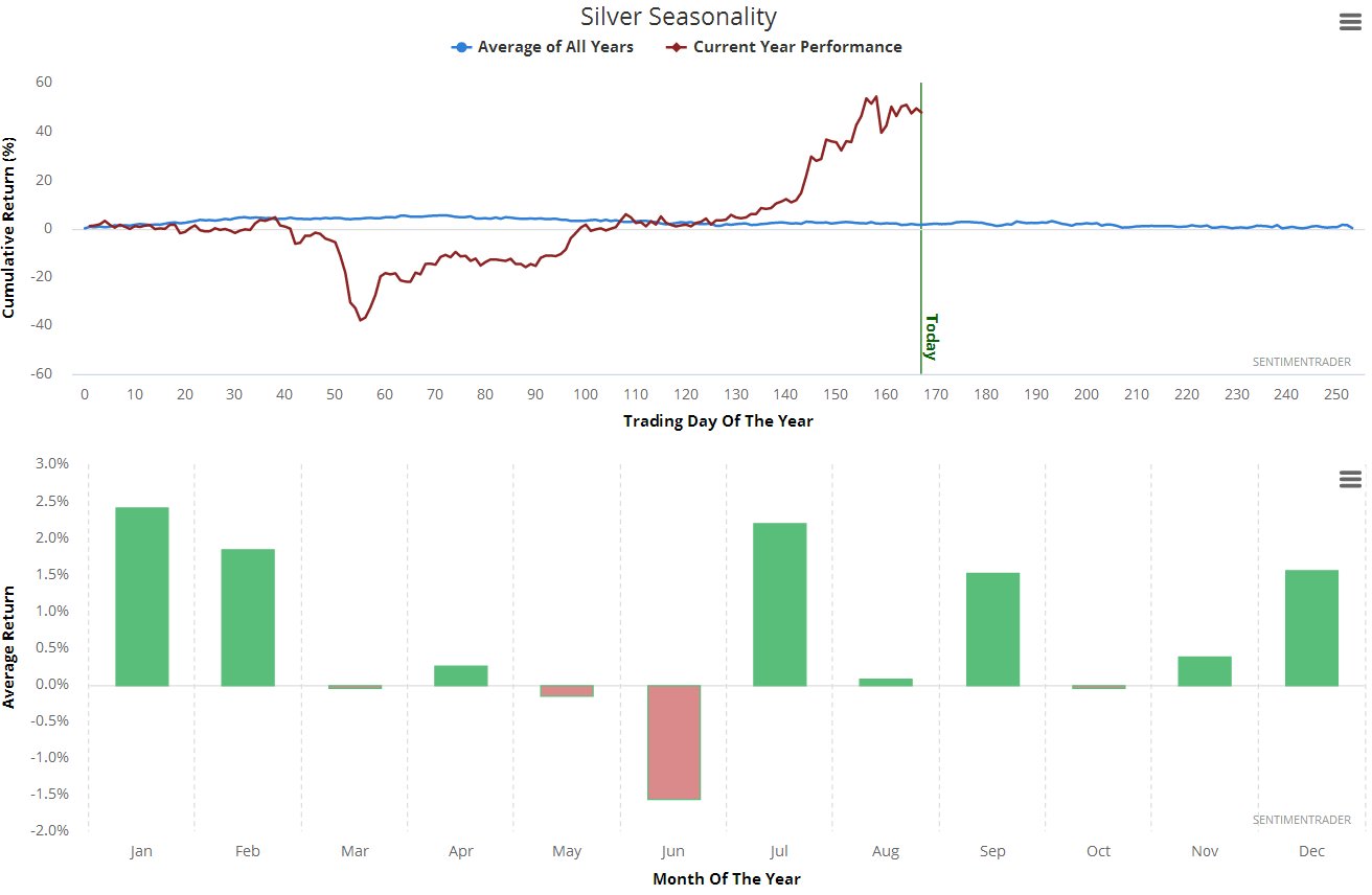
Silver Seasonality
End of update.
